
UI/UX DESIGN
EXPERIENCES
INTUITIVE INTERFACES, ENGINEERED FOR CONVERSION.
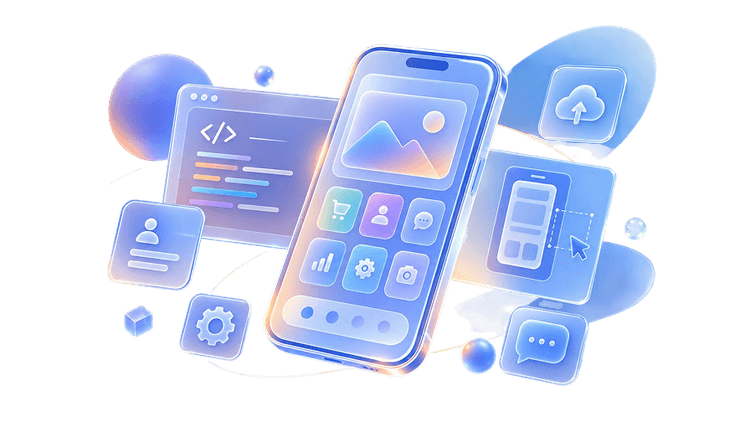
Great products start with user empathy. We design intuitive, high-converting digital interfaces that solve complex user problems and elevate brand perception.
TRUSTED BY TEAMS ACROSS 4 CONTINENTS
UI/UX
DESIGN
Trusted by teams
across 4 continents
- Healthcare
- Real Estate
- SaaS
- Ecommerce
- Enterprise
Great products start with user empathy. We design intuitive, high-converting digital interfaces that solve complex user problems.
DIGITAL EXPERIENCES
WE DESIGN.
Every digital product has unique users and distinct goals. We craft seamless interfaces that balance user delight with measurable business growth.
Websites
Business websites, corporate websites, landing pages and marketing websites designed to improve engagement and conversions.
Mobile Applications
Android and iOS applications designed around real user behaviour and intuitive navigation.
SaaS Platforms
Complex dashboards and enterprise software simplified into easy-to-use experiences.
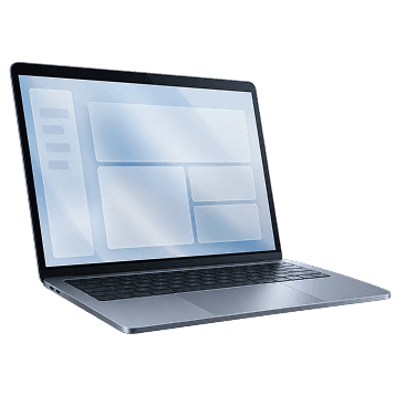
Ecommerce Experiences
Shopping journeys focused on increasing conversions and improving customer satisfaction.
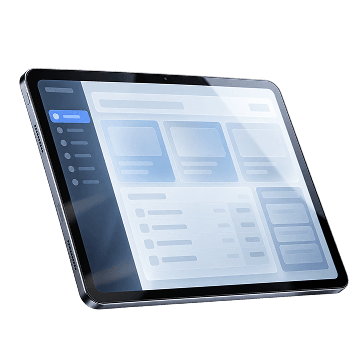
Enterprise Software
Internal tools, admin panels and business platforms designed to improve productivity.
Product MVPs
Helping startups transform ideas into validated digital products.
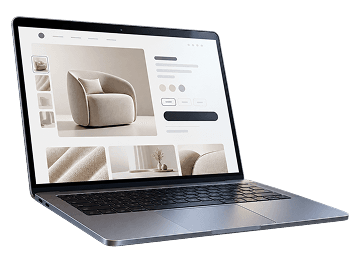
EVERY PRODUCT ISBUILT FOR USERS.
We don't rely on guesswork.
Every interface begins with deep user empathy, simplifying complex workflows into elegant, intuitive experiences.


WHAT MAKES OUR UI/UX DESIGN DIFFERENT.
UserFirst
Every design decision starts with understanding the people who will use the product.
BusinessFocused
Good design doesn't just look good. It helps businesses generate leads, improve conversions and increase customer satisfaction.
Built ForDevelopers
Designs are created with real development in mind, making implementation faster and more accurate.
ScalableDesign Systems
Instead of designing one screen at a time, we create reusable components that keep products consistent as they grow.
MobileFirst
Every experience is optimised across phones, tablets and desktops.
Accessibility
Designs that are easy to understand and usable for a wider range of people.
UserFirst
Every design decision starts with understanding the people who will use the product.
BusinessFocused
Good design doesn't just look good. It helps businesses generate leads, improve conversions and increase customer satisfaction.
Built ForDevelopers
Designs are created with real development in mind, making implementation faster and more accurate.
ScalableDesign Systems
Instead of designing one screen at a time, we create reusable components that keep products consistent as they grow.
MobileFirst
Every experience is optimised across phones, tablets and desktops.
Accessibility
Designs that are easy to understand and usable for a wider range of people.
INTUITIVE UI& UX SYSTEMS.
Modern digital products demand seamless user journeys. We craft data-backed interfaces, scalable component libraries, and developer-ready specifications.

User Research · Competitor Analysis · Product Strategy · Feature Prioritisation · User Flows · Information Architecture · Journey Mapping · Wireframes · High-Fidelity UI · Responsive Layouts · Mobile Design · Desktop Design · Tablet Design · Design System · UI Components · Typography · Colour System · Icons · Spacing Guidelines · Figma Files · Design Specifications · Assets · Documentation ·
User Research · Competitor Analysis · Product Strategy · Feature Prioritisation · User Flows · Information Architecture · Journey Mapping · Wireframes · High-Fidelity UI · Responsive Layouts · Mobile Design · Desktop Design · Tablet Design · Design System · UI Components · Typography · Colour System · Icons · Spacing Guidelines · Figma Files · Design Specifications · Assets · Documentation ·
TECHNOLOGYWE WORK WITH
MOBILE DEV
- Flutter
- Android
- iOS
BACKEND
- Node
- Laravel
- Firebase
- Supabase
INTEGRATIONS
Modern mobile apps need to work with other systems. We integrate applications with:
ADMIN DASHBOARDS
Every app needs a control centre. We develop custom admin panels to manage users, content, products, reports and business operations.


TECHNOLOGYWE WORK WITH
MOBILE DEV
- Flutter
- Android
- iOS
BACKEND
- Node
- Laravel
- Firebase
- Supabase
ADMIN DASHBOARDS
Every app needs a control centre. We develop custom admin panels to manage users, content, products, reports and business operations.
INTEGRATIONS
Modern mobile apps need to work with other systems. We integrate applications with:
DESIGN SYSTEMS WE BUILD
Organised Figma Files
Reusable Components
Auto Layout
Responsive Design
Design Tokens
Clear Naming
display: flex;
gap: 16px;
border-radius: 12px;Developer Notes
Design QA Support
Organised Figma Files
Reusable Components
Auto Layout
Responsive Design
Design Tokens
Clear Naming
display: flex;
gap: 16px;
border-radius: 12px;